Activity Blobs
Albert's item about Okular contributors (a great idea to thank those who contributed their time over the past year -- and I'll say thank you to all the Okular developers who make my document-reading-life a nicer place) and also Seif writing about Mozilla contributions spurred me to quickly hack together a tool to give an idea of the activity in one of KDE's git repositories. It's much like the venerable green-blobs graph that Paul Adams makes. It's just an indicator -- I've written about this time and time again, the graphs from one repository cannot be compared with other repositories, and the best you can quickly conclude based on these pictures is whether development activity in a repository is carrying on "as usual" or has changed.
So here's a graph of Parley, a small program that is probably considered feature complete.
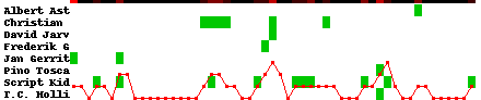
This is three different graphs mashed into one. There's no dates on the graph, but it covers roughly the past year of development.
- The green blobs indicate that the named contributor committed in that week. So for Albert (the same one) there's a single commit at about week 40 in this view. Christian (Muschick, I was lazy in coding up the labels and just cut off the string at 10 characters) was active about half a year ago, and there are incidental commits from others. Script Kid is our own translation commit-bot, who shows up everywhere. Anyway, the green blobs give an idea of who's active, when.
- The red line is an indicator of how large the active contributor community is. The bottom of the image is 0 (up to a maximum of all the contributors). In the past, we defined all kinds of complicated metrics to do so, with exponential decay applied to each contributor's "activeness" and such. This one is dead simple: a participant is an active contributor if he or she has a commit in a given week or in the previous week. That is, each person is considered active for at least seven days after their last commit. This is easiest to see at the beginning of the graph, where Jan's single commit shows two weeks of "active community size is 1", and right in the middle, where Scripty counts for two weeks and then drops away.
- The top black-ish line gives an indication of "temperature" in the repository, mapping the number of commits that week to a color, where pure red is "the maximum number of commits" and black is "none at all". Since this repository has a maximum of three commits in a week, the color scale shows few different levels. This is another way of looking at the activity of the repository. Instead of number of active contributors, look at the average commit-churn.
Each of these indicators in itself isn't all that interesting. And they're naturally correlated in Parley, with the most active week with the most contributors coinciding. It's possble for that to be otherwise, though.
(The temperature graph, in particular, is something I'm not really happy about as it doesn't give a good feel for activity; most of the weeks are way too dark even when something is happening, and you can hardly tell #000000 and #230000 apart in small boxes like this. I'd like to have something more sophisticated than a linear interpolation between 0 and 255. Ideally something that goes from "cold" to "hot" in a colourful fashion, but I don't know about color curves and things like that.)
So how about Okular?
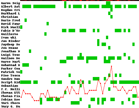
I hope that's the same list of contributors as what Albert -- who you can see is almost always active -- mentions in his thank-you note. You can see who the "regulars" are in Okular, who drops in occasionally, and who seems to be a one-off occurrence (which means a bug fix, or a single contribution -- those too are appreciated!). On average, there's five, maybe six people active. You can see some "hot" weeks commit-wise, even weeks uncorrelated with increased contributor numbers. (O yeah, Ivan: the Python Imaging Library doesn't like Unicode when used with its default font, so your name and others get short shrift).
Supposing you're a community manager (or a project leader, or just concerned about the activity in some particular application) then you might watch one of these graphs to detect changes. Although given the implementation here, you're always a week late (and again: you're then looking for explanations a posteriori).
I'd show the kdelibs repository as well, but it's mostly very tall. because there's lots of names in it in total, and an average active contributor count of sixteen or so (by my primitive definition of "active"). There's something weird going on with the distinction between "authored date" and "committed date", but that's for a different time.